



タブレットエンボス加工のクリアデザインガイドライン, 耐久性のあるマーク
Clear tablet marks begin with simple artwork, balanced feature geometry, enough spacing, and placement that respects the tablet profile. The design must also work with the actual formulation, 圧縮条件, and coating process. A mark that looks correct in a drawing can still pick during compression or lose definition after film coating.
Punch-tip markings are only one part of the tooling system. パンチに関するより広い情報, これだ, tooling families, and press compatibility, 参照 タブレットプレスの金型タイプ. This guide stays focused on the design and validation of the mark itself.
There is no universal stroke depth, 角度, width, or spacing that works for every product. Published dimensions are starting points. Final geometry must be tested with the intended tablet profile, 定式化, 報道, コーティング, and identification requirements.
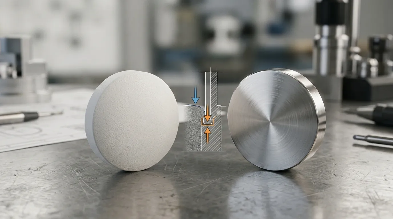
Embossed, Debossed, Engraved, and Imprinted: Define the Mark First
Tablet and tooling teams do not always use embossing terminology in the same way. A controlled drawing should therefore describe both the punch feature and the intended result on the finished tablet.
Under the U.S. definitions in 21 CFR パート206, an embossed mark is raised above the surface of the dosage form, while a debossed mark is below the surface. An engraved mark is cut into the dosage form after it has been completed. “Imprinted” is the broader term covering marks made by embossing, debossing, engraving, or printing.
| 用語 | 仕上げ板の結果 | 対応するパンチフェイスの特徴 |
|---|---|---|
| エンボス加工のマーク | タブレット表面の上に持ち上げられている | パンチフェイスの凹んだ特徴 |
| デボストマーク | 板の表面の下に埋め込まれています | パンチフェイスの盛り上がった特徴 |
| 刻印 | 形成後に完成した投与形態に切り込む | 必ずしも圧縮中に形成されるわけではありません |
| インプリント | 一般識別標識 | いくつかの方法で作成できます |
The inverse relationship matters. A raised letter on the punch produces a recessed letter on the tablet. A recessed letter in the punch produces a raised tablet feature.
Drawings should not rely on labels such as “emboss logo” alone. They should state:
- whether the finished tablet mark is raised or recessed;
- which punch face carries the feature;
- the intended mark orientation;
- the controlled artwork revision;
- which dimensions apply to the tool and which apply to the finished tablet.
This prevents a supplier, product team, and quality team from approving different interpretations of the same artwork.
Start With the Identification Requirement, Not the Original Artwork
The original logo is rarely the best starting geometry for a tablet punch. Branding artwork may contain thin lines, 鋭い角, small gaps, or decorative details that cannot be reproduced reliably at tablet scale.
Begin by defining what the mark must communicate:
- product or manufacturer identity;
- dosage strength;
- letters or numerals used for differentiation;
- a logo or symbol;
- a combination of these elements.
Identification should take priority over decorative fidelity. アメリカ合衆国. FDA’s 製品設計および投薬エラー防止に関するガイダンス recommends clear differentiation among drug products and strengths. Other markets may apply different regulatory requirements, so the final design needs jurisdiction-specific review.
A practical artwork review can divide details into three groups:
| 判決 | 典型的な治療 |
| 保持 | Essential letters, numerals, strength identifiers, and recognizable logo elements |
| 簡略化 | Fine curves, narrow gaps, decorative terminals, closely spaced elements, and complex enclosed areas |
| 削除 | 識別に役立たず、タブレットサイズでも判読可能な詳細 |
For product families, review the smallest tablet and the most crowded face first. A logo that fits comfortably on a large tablet may fail when scaled down for a lower-strength version. It is also risky to produce several strengths with codes that differ by only one small or easily obscured feature.
Anti-counterfeiting details may support product identification, but extra complexity should not compromise readability, manufacturability, or coating performance.
文字やロゴを製造可能な特徴ジオメトリに変換する
A tablet mark is a three-dimensional feature, not flat artwork. Its performance depends on the relationship among stroke width, 深さ, wall angle, 半径, and spacing.
Changing one variable affects the others. A deep feature with narrow strokes may be difficult to release or coat. A wide but very shallow feature may lose definition after spring-back or handling. Closely spaced characters may appear separate on the uncoated core but merge after coating.
| 幾何変数 | 主な機能 | バランスが悪いときのリスク |
| ストローク幅 | 目に見えるラインウェイトと構造的支えを作り出します | Thin strokes may wear, fill, or become fragile |
| 機能の深さ | レリーフと視覚的な輪郭を生み出します | 過剰な深さは粉末の保持やコーティングの充填を増加させる可能性があります |
| 壁の角度 | パンチ機能からのリリースをサポートしています | 急峻または急峻な壁は局所的な保持を増加させることがあります |
| 下半径 | 鋭い内部遷移を除去します | 鋭い底は物質を閉じ込めたり、応力を集中させたりすることがあります |
| 文字間隔 | 特徴を視覚的に分けて保存します | Narrow gaps may pick, bridge, or disappear after coating |
| コーナー半径 | 鋭い幾何学的詳細を削減します | 鋭い角は弱いか再現が難しい場合があります |
研究 医薬品錠剤におけるデボス型特徴形成 shows that stroke angle, pre-pick geometry, lubricant conditions, material density, and elastic recovery can affect feature fidelity. This means the dimensions in the punch drawing will not always appear unchanged on the finished tablet.
Some tooling guides publish recommended angles, depth-to-width relationships, or radius proportions. These can be useful starting points, but they are not universal standards. Feature size, formulation behavior, tablet curvature, coating requirements, and the measuring convention all influence whether a particular proportion is suitable.
均一性のためにフォントとストロークの形を選択してください
Sans-serif fonts are often easier to adapt because they can use more uniform line widths and fewer decorative terminals. Serif fonts may contain thin ends, narrow transitions, and partially enclosed details that become fragile when reduced.
This does not mean every serif design must be rejected. The practical question is whether the selected font can be modified to maintain:
- consistent stroke weight;
- readable open spaces;
- rounded internal corners;
- adequate separation;
- sufficient feature support;
- recognizable character shapes.
A custom technical font may work better than preserving a standard commercial typeface exactly. The finished tablet needs to remain identifiable; it does not need to reproduce every typographic detail in the source file.
Balance Width, Depth, 角度, Radius, and Spacing
These variables should be reviewed together rather than approved one at a time.
A deeper mark can improve initial visual definition, but it may also create narrow areas that fill during coating. Increasing stroke width may improve durability, but excessive width can close counters or reduce spacing between characters. Rounding the bottom and corners can support release, yet excessive rounding may soften a small character until it becomes difficult to distinguish.
The design should preserve enough contrast for identification without creating isolated, steep-sided, or tightly packed features. Trial tablets are needed to confirm that the chosen balance survives compression, 射出, コーティング, and handling.
Redesign Counters, Islands, and Peninsulas Before They Cause Picking
Enclosed and partially enclosed character areas are frequent sources of tablet picking.
ある カウンター is the enclosed space within a character. The tool feature surrounded by that space is sometimes described as an 島. Letters and numerals such as A, B, D, O, P, R, 0, 6, 8, and 9 contain enclosed regions. ある 半島 is a partially enclosed projection, such as the inner portion of some letters or logos.
These areas can compact and release differently from the surrounding tablet face. Material may remain attached to the punch feature and pull away from the tablet, leaving an incomplete mark.
| リスクの高い特徴 | 典型的な問題 | 可能な設計反応 |
| 小さな囲い型カウンター | 局所的な資料保持 | カウンターを開けるか拡大するか |
| 高い孤立島 | 囲まれた特徴の検討 | 特徴の高さや奥行きを下げる |
| 狭い半島 | 弱遷移と局所ピッキング | 半島をテーパーまたはランプで切り上げる |
| 鋭い内角 | 火薬トラップまたは応力集中 | 適切な半径を加えます |
| 2つの近接カウンター | 不十分な材料分離 | スペースを広げたり、キャラクターをシンプルにしたりしましょう |
An open counter removes part of the enclosure while preserving the character’s identity. Pre-picking, sometimes described as a reduced counter, intentionally reduces the vulnerable feature height or depth. A tapered peninsula blends the projecting feature more gradually into the surrounding surface.
These modifications involve trade-offs. An aggressive reduction may improve release but weaken the visual character. A wide opening may prevent picking but make two different letters look similar.
Pre-pick percentages and taper dimensions should therefore be treated as application-specific. The peer-reviewed study on debossed features found that pre-pick geometry and stroke angle influenced feature formation, but it did not establish one design that is correct for every formulation.
マークは安全な範囲内に保管してください
The full visible tablet face is not automatically available for artwork. The safe zone is the practical area in which the mark can be placed without crowding the tablet edge, weakening the landed region, or creating difficult punch geometry.
The safe zone depends on:
- tablet size and shape;
- cup curvature;
- land position;
- mark orientation;
- the feature on the opposite face;
- any break line;
- expected coating buildup.
Artwork should not be scaled to the maximum theoretical area. Small changes during manufacturing or coating can make a mark that already sits close to the edge appear crowded or incomplete.
Placement also affects local performance. Moving an identifier away from the exact center may reduce a recurring local picking condition in some designs, but off-center placement is not universally better. It can create new balance, 外見, or inspection problems.
Use this placement check before approving the face layout:
- Keep critical strokes and character corners clear of the landed edge.
- Leave enough space for coating and visual separation.
- Check the design in its actual orientation, not only as isolated artwork.
- Compare both tablet faces together.
- Confirm that logos, codes, and functional lines cannot be confused.
- Review the smallest tablet in the product family.
A functional score line has different requirements from an identification mark. Where both features share one face, coordinate their spacing and visual hierarchy, then move the splitting analysis to the dedicated タブレットブレークライン設計 ガイド.
マークをタブレットのプロファイルとカップの深さにマッチさせる
Tablet profile changes both the usable marking area and the compression conditions around the mark.
A shallow cup generally provides a flatter central region, while a deep cup creates greater curvature and can reduce the area available for detailed artwork. Placing a complex mark in a highly curved region may produce inconsistent stroke depth or crowd features near the edge.
| プロフィールの考慮 | エンボス加工の含意 |
| 浅いカップ | Larger apparent marking area, but tablet performance still requires validation |
| ディープカップ | 中央部は使いにくい部分と、マーク周辺の曲がりが急になります |
| 単一半径プロファイル | 単純な曲率ですが、設計制約を中心に集中させる可能性があります |
| ダブルラディアスまたはコンパウンドプロファイル | 中央領域やエッジ遷移の制御をさらに提供できる可能性があります |
| 大きなプロフィール変更 | マークだけでなく、完全なタブレット評価が必要です |
Cup depth can also influence local compaction. Detailed central features may behave differently if the formulation does not compact uniformly around the punch geometry.
Changing from one profile to another should not be treated as a minor embossing correction. It can affect tablet strength, ハンドリング, コーティング, and other product characteristics. The profile should only be changed through the broader product-development and validation process.
Design for the Coated Tablet, Not Only the Uncoated Core
A mark can be sharp immediately after compression and still fail on the final coated tablet.
Film coating adds material to the surface and exposes tablets to movement, contact, drying, and handling. The main imprint-related defects include:
- Bridging: coating spans across a recessed area instead of following its full contour.
- Infill: coating material accumulates within a feature and reduces its visible depth.
- Erosion: edges lose definition through movement or abrasion.
- チップ: local tablet material breaks away around a feature.
- Softening: fine details remain present but become visually indistinct.
Narrow gaps and deep recesses are particularly vulnerable to infill. Sharp transitions may not coat evenly. Very fine raised features may lose definition through contact or abrasion.
| コーティング段階の症状 | 設計上の貢献の可能性 | 最初の設計チェック |
| キャラクターの融合 | 間隔の不十分さ | 分離感を増やしたり、アートワークをシンプルにしたりする |
| 休み時間は満員のようです | 過剰な深さや狭い空洞 | Review depth, width, 角度, and bottom radius |
| 細かい線は消える | ストロークが狭すぎる | 近くのスペースを閉じずにラインの太さを増やす |
| 縁が丸みを帯びているように見えます | コーティングシステムには細かすぎる | 機能を簡素化する |
| 取り扱い中のチップの痕 | 弱い局所タブレット幾何学 | Review feature location, プロフィール, そしてタブレットの完全性 |
Coating thickness and operating parameters vary by product. They should not be estimated from a general article. The correct test is to run the intended coating process and inspect the final tablet under the defined production and quality conditions.
Core-tablet approval alone is insufficient when the marketed product will be coated.
デザインを変更する前にピッキングやスティックを診断しましょう
Picking and sticking are related but not identical.
Picking is usually localized. Material is removed from a specific tablet area and remains attached to a punch feature, often around a letter, numeral, 島, or peninsula. Sticking is broader adhesion of the formulation to the punch face. Filming develops when a deposit gradually builds across part of the tool.
その IQコンソーシアムによるスティッキング・アンド・ピッキングのレビュー describes these as multifactorial problems involving formulation, 金型, and manufacturing conditions. Geometry may contribute, but it is not the only possible cause.
| 観察されたパターン | 設計上の原因として考えられる | 設計外の原因の可能性 | 最初の検証ステップ |
| 1つのカウンターで欠陥が繰り返されます | 囲まれた島や急峻な局所的特徴 | 局所的なパンチダメージ | 正確な特徴と工具の表面を点検してください |
| 素材はいくつかの狭いストロークで集まります | 間隔が足りないか、鋭いジオメトリ | 高い配合接着率 | 標識のあるエリアと未標識のエリアを比較する |
| 接着力がパンチの大部分を覆っています | 一人のキャラクターだけである可能性は低いです | Moisture, 潤滑, 湿度, 圧縮条件 | 調合およびプロセスデータのレビュー |
| 故障は運行中に悪化します | 預金はさらなる保持を促進します | 温度, 湿度, filming, 工具の状態 | 線路のタイミングと運用条件 |
| 問題はコーティング後にのみ発生します | 幾何学がコーティングを閉じ込める可能性がある | コーティングの配合やプロセスのバリエーション | コアタブレットとコーティングされたタブレットを比較してください |
Tool steel and surface coatings may be relevant after the root cause is understood. They should not be the automatic first response to every mark defect.
マーク幾何学が寄与している兆候
Geometry is a stronger suspect when:
- the defect always appears in the same letter, numeral, カウンター, or peninsula;
- the failure follows one narrow gap or sharp corner;
- surrounding unmarked areas remain clean;
- the problem is consistent across otherwise stable operating conditions;
- a controlled geometry revision changes the local defect pattern.
This evidence does not prove that geometry is the only cause, but it helps narrow the investigation.
根本原因が他にある兆候
Look beyond the mark design when:
- deposits appear across broad unmarked regions;
- severity changes with humidity, formulation moisture, or run time;
- the defect changes after adjusting compression conditions;
- lubricant level or distribution is inconsistent;
- scratches or damage are visible on the punch surface;
- multiple unrelated characters fail at the same time.
Several causes may operate together. A narrow counter can be marginal under normal conditions and begin picking only after humidity or formulation moisture increases.
生産ツールをリリースする前に設計を検証してください
Artwork approval is not production validation. The mark must be evaluated with the intended formulation, tablet profile, 報道条件, coating process, and final inspection requirements.
A practical validation sequence is:
- Confirm the identification requirement.
Record the required letters, numerals, strength information, logo elements, and market-specific constraints. - Freeze the artwork revision.
Use one controlled source file and document all simplifications. - Define the finished-tablet result.
State whether each feature must be raised or recessed and identify the corresponding punch-face geometry. - Review manufacturability.
Check stroke width, 深さ, 角度, 半径, spacing, counters, peninsulas, safe-zone clearance, プロフィール, and score-line interaction. - Produce and test trial tooling where appropriate.
Evaluate mark fidelity, ピッキング, くっつく, tablet integrity, and tool condition under representative compression conditions. - Inspect after the intended coating process.
Check for bridging, infill, erosion, merging, and loss of identification. - Control acceptance and future revisions.
Record the approved artwork, tool drawing, inspection method, visual standard, and replacement-tool revision.
デザインパッケージに含める情報
A useful supplier or internal design package should contain:
- controlled artwork and revision number;
- intended finished-tablet appearance;
- tablet dimensions, 形状, and profile;
- mark assignment to the upper or lower face;
- break-line position, 該当する場合;
- formulation behavior relevant to sticking or spring-back;
- coating requirement;
- press and tooling-system context;
- visual and dimensional acceptance criteria;
- product-family or strength-differentiation requirements;
- 必須教材, 検査, and traceability documentation.
Do not assume that a supplier will interpret a flat logo file, tablet sketch, and phrase such as “engrave this” in the same way as the product team.
Inspect the Core, Coated Tablet, and Replacement Tooling
Inspection should cover three stages:
| 舞台 | 確認すべきこと |
| 被覆されていないコア | Feature completeness, local picking, tablet integrity, and consistency during the run |
| コーティングされた錠剤 | Final legibility, bridging, infill, erosion, and visual differentiation |
| 交換用金型 | Drawing revision, feature dimensions, 向き, and consistency with the approved result |
実用的な場合, retain approved visual samples or controlled reference images. These can help distinguish acceptable normal variation from a true loss of legibility.
Replacement tooling should reproduce the approved design revision rather than an uncontrolled copy of a worn tool or an outdated artwork file.
タブレットエンボスデザインレビューチェックリスト
Before releasing the design, 確認してください:
- the terminology clearly separates the punch feature from the finished-tablet mark;
- essential identification content has priority over decorative detail;
- the artwork has been simplified for tablet scale;
- the font uses workable stroke forms and spacing;
- counters, islands, and peninsulas have been reviewed;
- 深さ, width, 角度, 半径, and spacing are balanced;
- critical features remain inside the usable safe zone;
- the mark does not conflict visually or physically with a break line;
- the tablet profile provides enough usable marking area;
- coating bridging, infill, and erosion have been considered;
- formulation and process causes have been checked before redesign;
- trial-compression and post-coating inspections are defined;
- visual and dimensional acceptance criteria are documented;
- artwork and tooling revisions are controlled.
Sunshine’s website states that it supplies general custom mold components and accepts drawing-based custom-part inquiries. It does not currently provide enough public evidence to claim pharmaceutical tablet-tooling or imprint-validation capability. Teams with a relevant custom-component requirement can お問い合わせ サンシャイン to confirm whether the requested part falls within its actual manufacturing scope.



サンシャインより書かれました
サンシャインで, 私たちは精密金型部品の専門製造およびサプライヤーです, プレスおよび射出成形用途向けの幅広い製品を提供しています. 私たちの主な焦点はパンチダイスです, イジェクターピンとスリーブ, ガイドポストとブッシング. 高度なCNC加工技術で, 厳格な品質管理, そして強力な生産能力, 私たちは信頼性を保証しています, 高精度部品, また、迅速かつ効率的なグローバル供給のための在庫の標準部品も併用しています.
ニュース
サービスを受けましょう
あらゆる予算に合った高品質な部品と、親切なスタッフが訓練されていて、訪問を有益で手間なく充実させてくれます.
